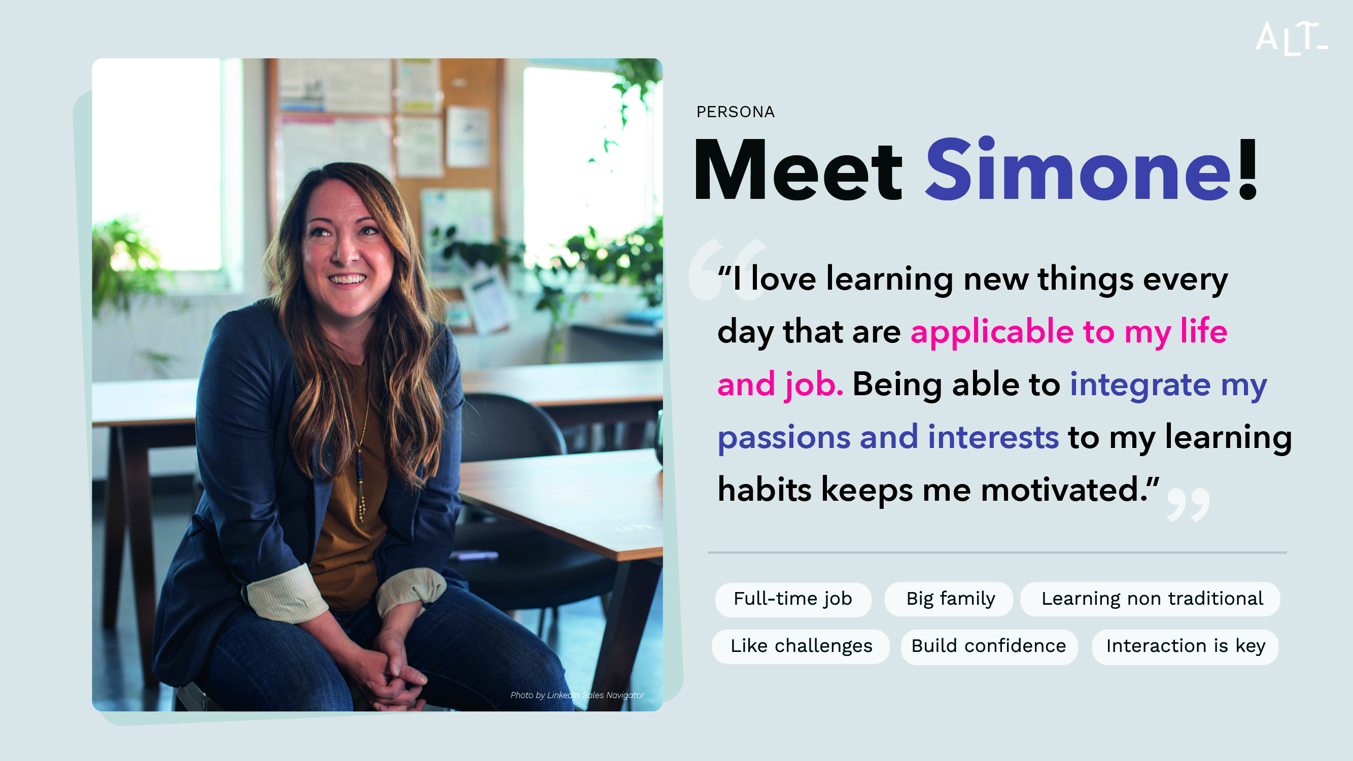
So what can we actually create for Simone? In order to do that, let’s pin down our problem statement:
Simone needs a way to learn vocabulary in an entertaining and relatable format because she loses motivation when the learning material is boring and has no context.
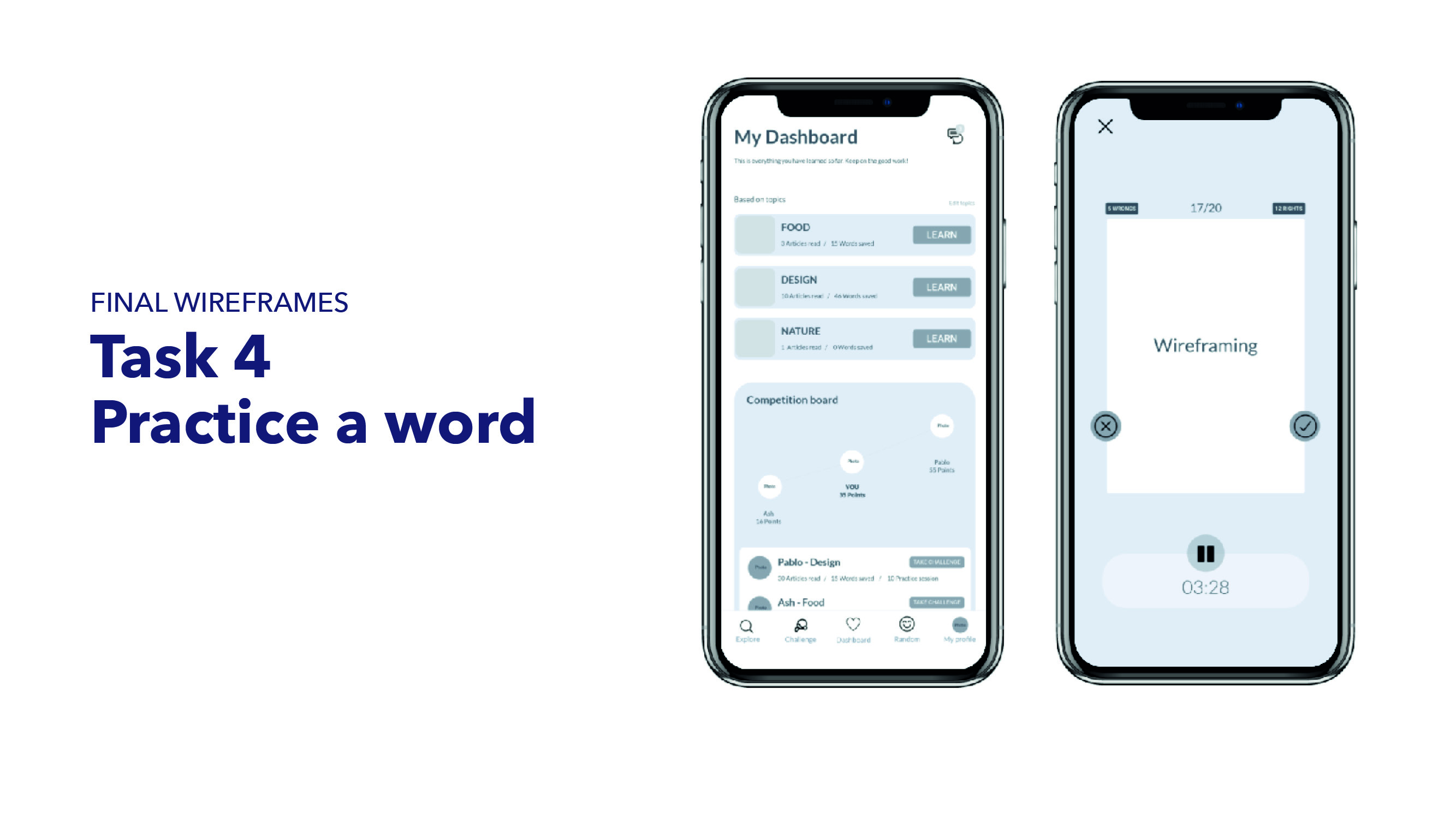
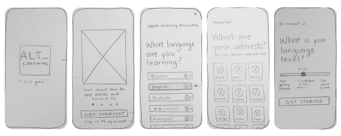
Based on the user flows, simple wireframes where created. The first details the user journey from downloading the app till they are in the home page and decide to read an article.
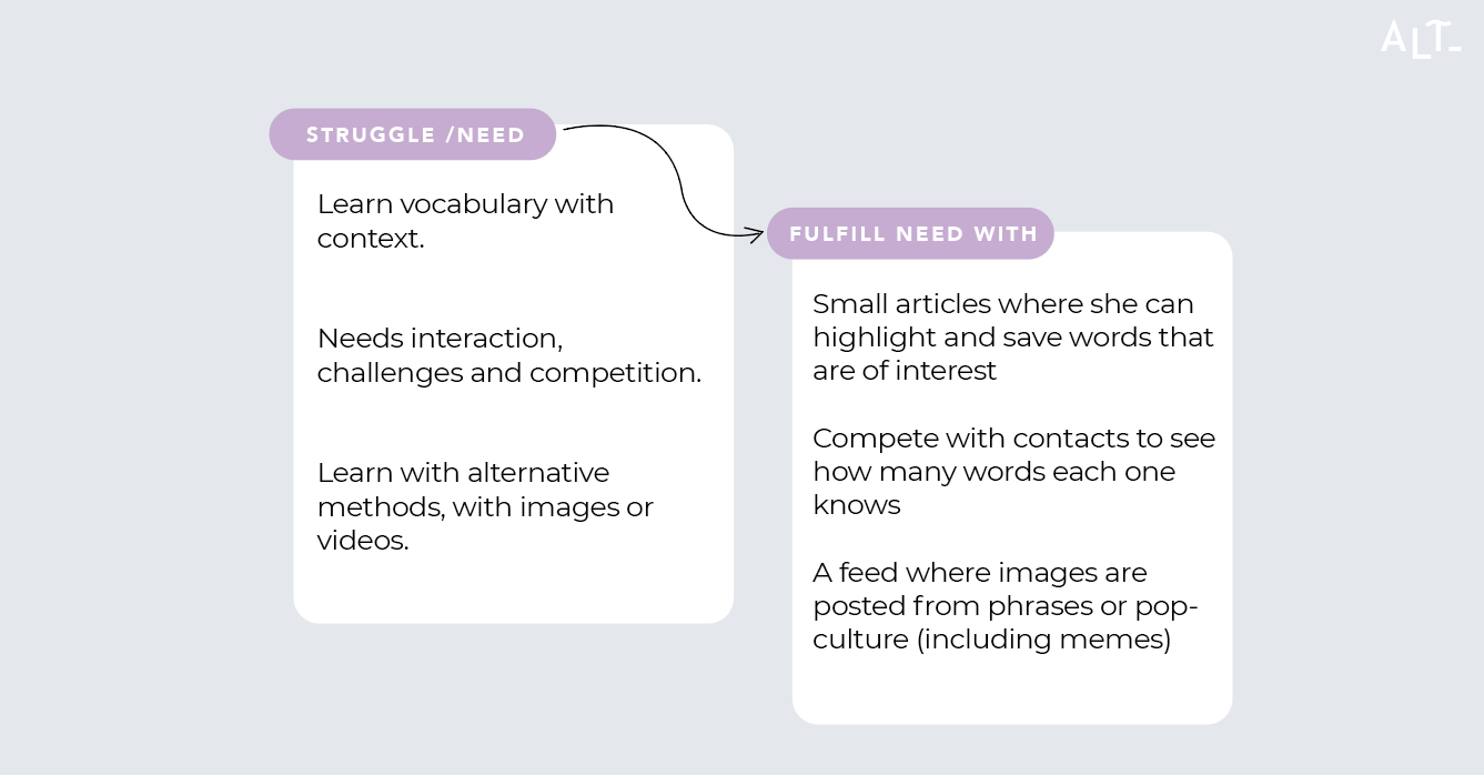
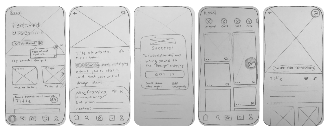
In the second one, I worked on the Random feed. This is where Simone finds images and videos related to her interest but also like a normal social media feed, with kind-of random content. This feature came straight out of the user interviews. Although the interviewees belong to different age groups and backgrounds, they all described the need for content to be presented in a more entertaining way.
From this hand-made wireframes, I jump to the digital prototypes.
Just as a sidenote: Before the final testing began, I decided to dip my toes into an informal testing with a family member, there I learned that my assumptions are sometimes wrong in terms of what the user is familiar to and what they would find logical.
The most important example would be the use of icons, there I found the users tested preferred a combination of icon + word.
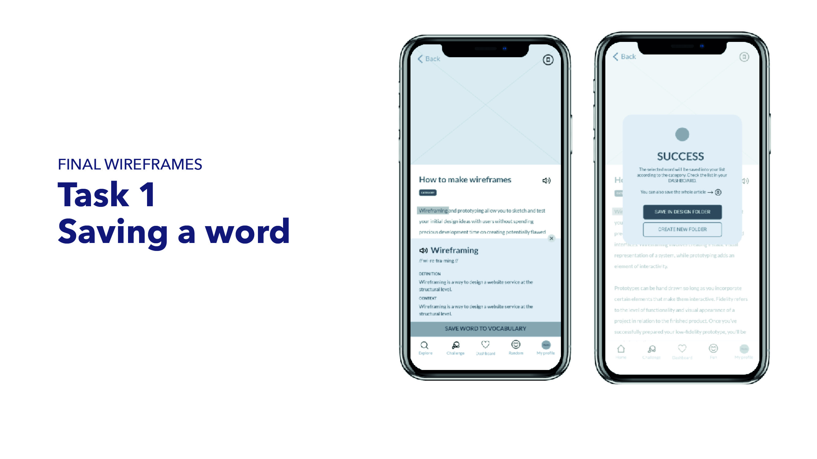
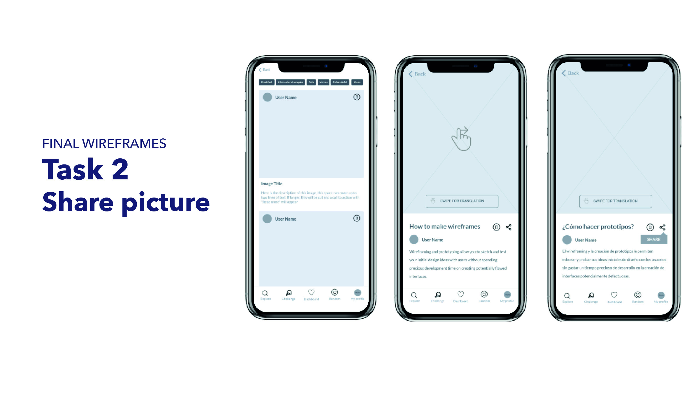
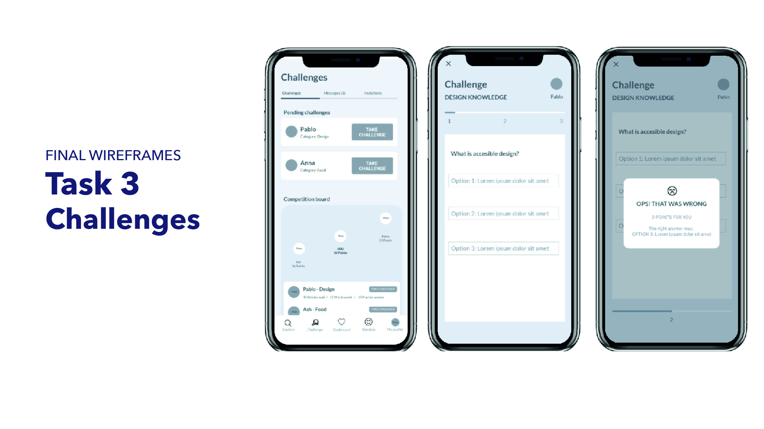
The users of my usability tests were able to give me great insights and feedback. This is the tasks and results: