
The wine consumption market has grown in the recent years, specially the online offerings and through the lockdowns applied in 2020-2021 many winemaker and wine sellers opted to improve their online presence and take part in online wine tastings. However, the efforts are scattered and there is no unified platform where users can explore and choose a specific wine experience.
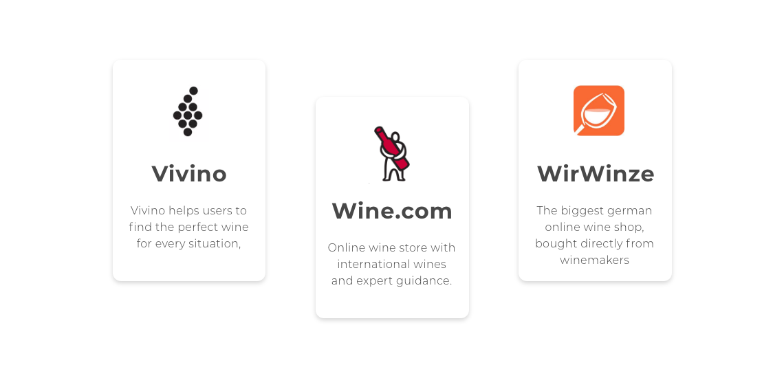
Direct regional competition includes Vivino, WirWinzer, Weinfreunde as they provide online shops where users can buy wines and wine packages. More specific competitors in relation to online wine tastings would include wine.com (although it’s limited to the USA the wine tasting can be watch all around the world) and MioMomente, which offers wine-boxes with online wine tasting (made as a response to the lockdown).
TARGET AUDIENCE
🍷 User 1: Wine lover
As the name describes, they are wine lovers, they enjoy good wine and are interested in getting to know insights and details about the wine. They use and trust online shopping portals.
🧑 User 2: Wine expert
Includes winemakers, sommeliers, wine sellers and enthusiasts. The users who join are avid technology users and are open to learning new ways to market their winery and get new customers.
SITUATION ANALYSIS
🧠 Opportunity
Online wine tasting are on demand and leveraging online offers can lead to successful customer journeys. Expanding to online wine tastings improve the chances of purchase, retention and advocacy.
⚠️ Possible challenges
Resistance from the wine experts to create and present their wine on an online format. Once the lockdown is lifted or people are able to move freely, online wine tastings may not be attractive, therefore the service needs to foresee changes in the offer.
Collected quantitative and qualitative data through 85 surveys and 6 interviews to explore the viability of the project, behaviors, needs and pains of potential users.ick and start writing.
The survey was only conducted from the point of view from the consumer.
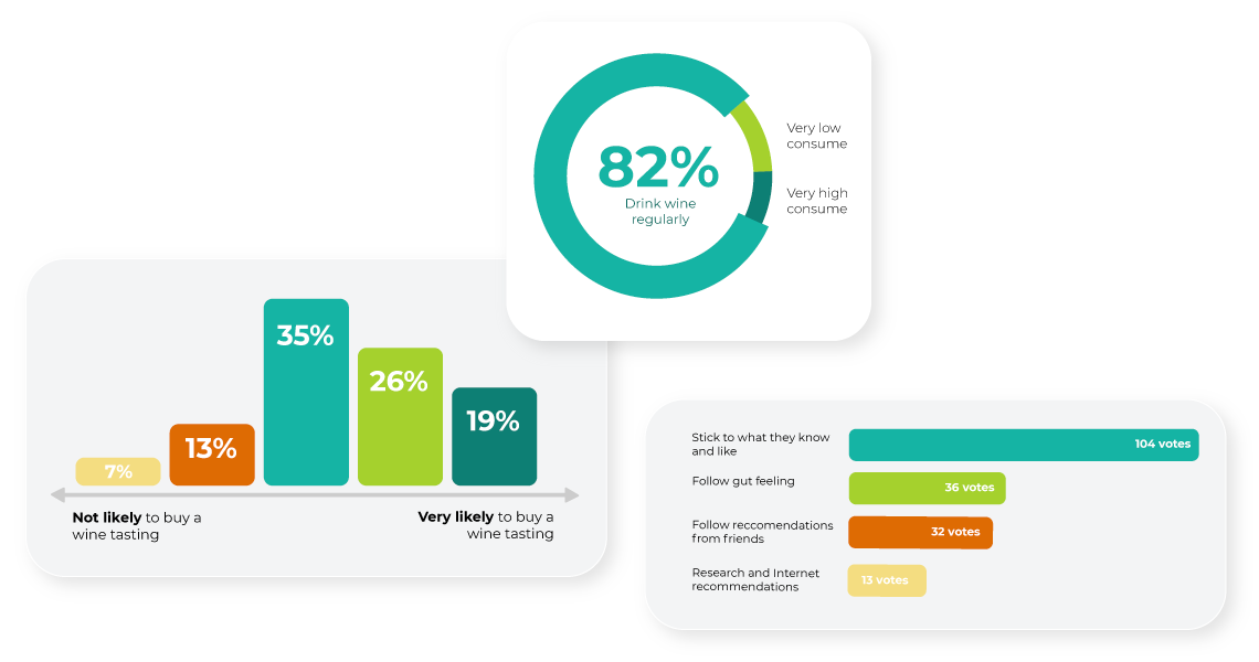
The research goals need to be divided into the two target audience, as they don’t have the same needs and won’t add up to the same user persona. Consequently, these are the key takeaways from the interviews:
- Wine is a hobby
- Have participated and like online wine tastings
- Very positive perception of winemakers and experts
- Want to understand wine
- Want to support local winemakers
- Search and discover based on wine type and region, not directly by following a brand
- Winemakers are also wine lovers
- Passionate about wine and sharing insights with wine lovers
- Brand awareness, marketing, promotion and reputation are important
- Need easy and tailored solution, where creating an event is not a hassle
- Intentionally about “faceless corporation”, want to always have a close relationship with wine consumers
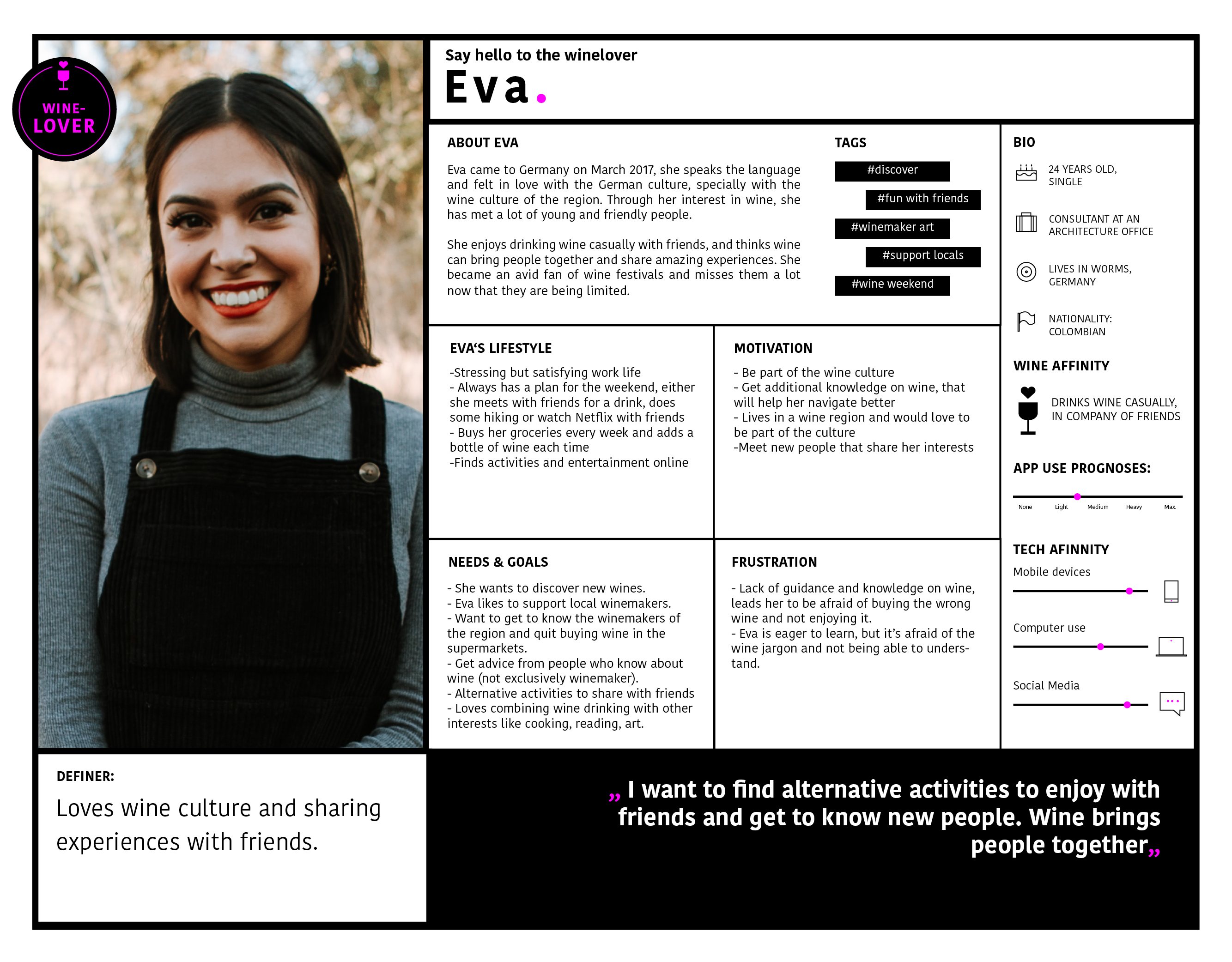
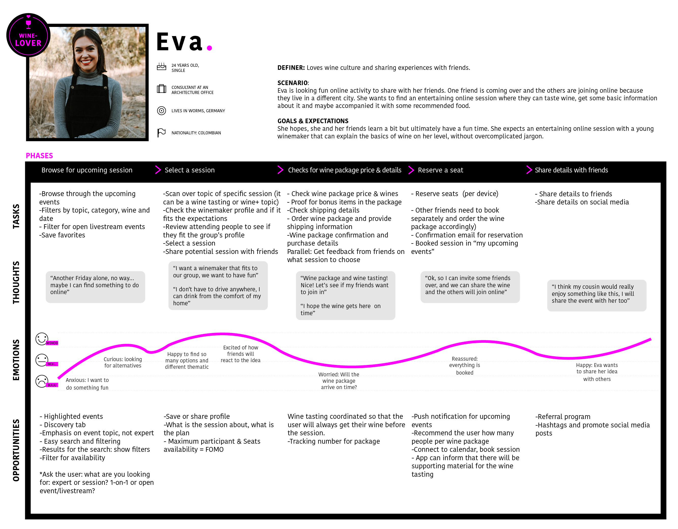
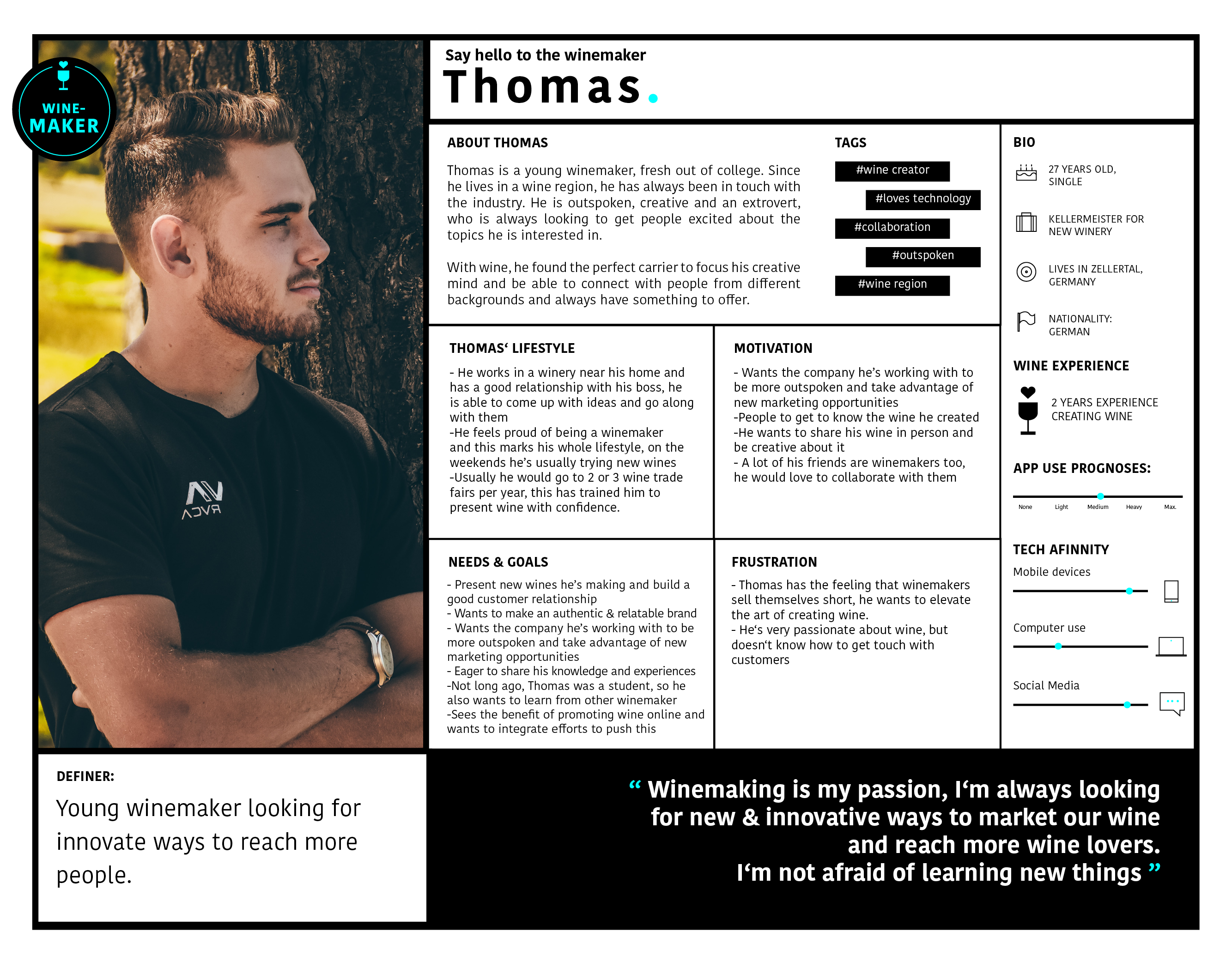
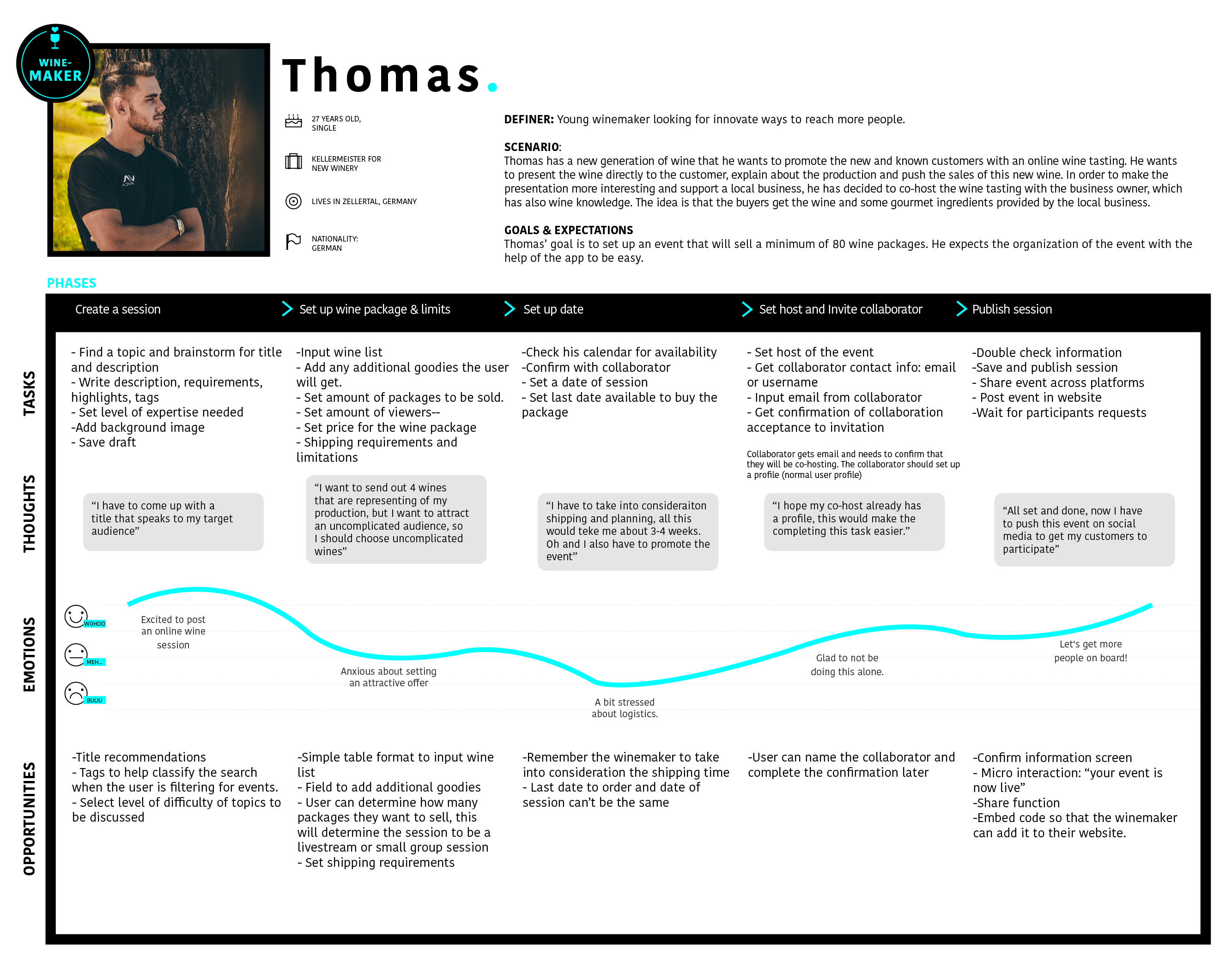
As a result of the research 4 personas were created and for each a user journey - they represent the wine lovers and wine experts point of view, needs, goals and overall definers. Here we'll focus on only 2 main personas.
Wine Lover Persona
Wine Expert Persona
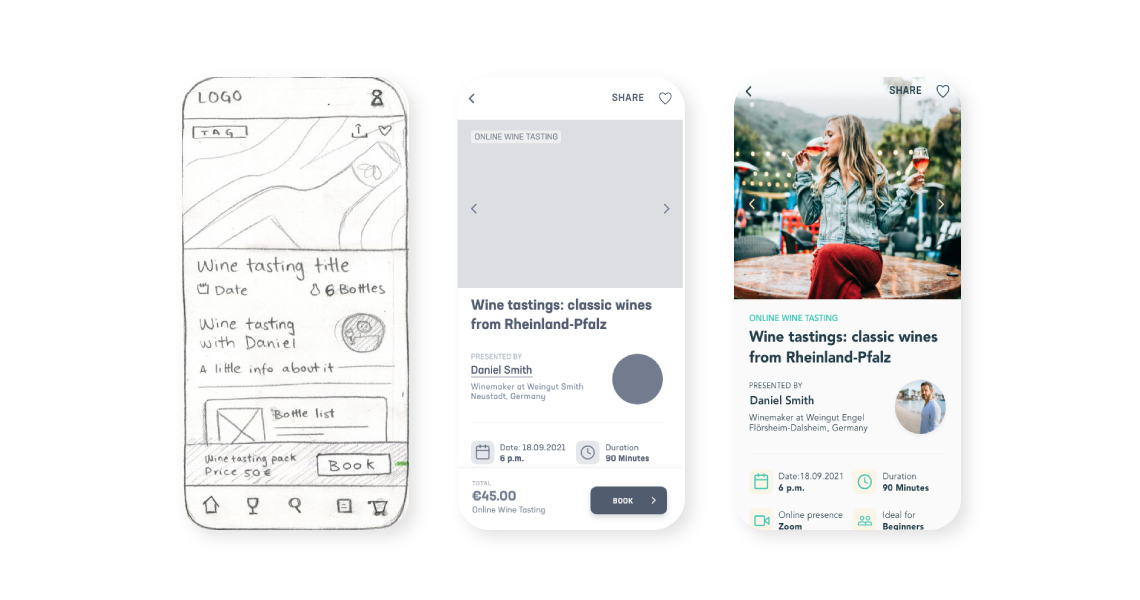
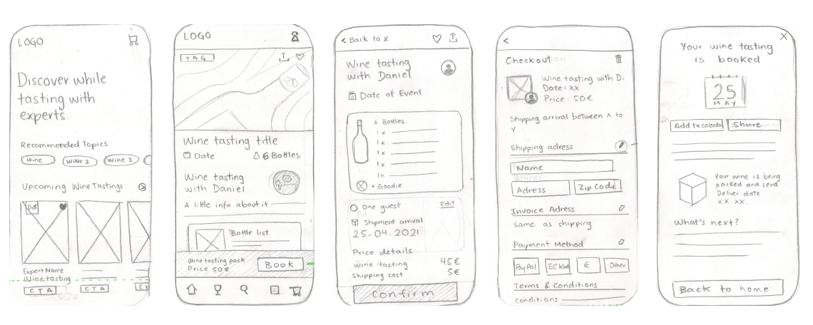
After the extensive research to determine who and why the product was going to be used, it was time to visualize the proposed solution. Based on the user flows and site maps, basic paper sketches were created, which were later transformed into wireframes.
Paper sketches are key for the rapid exploration of concepts, here I did continuous rounds of 4-minute sketching per planned screen.
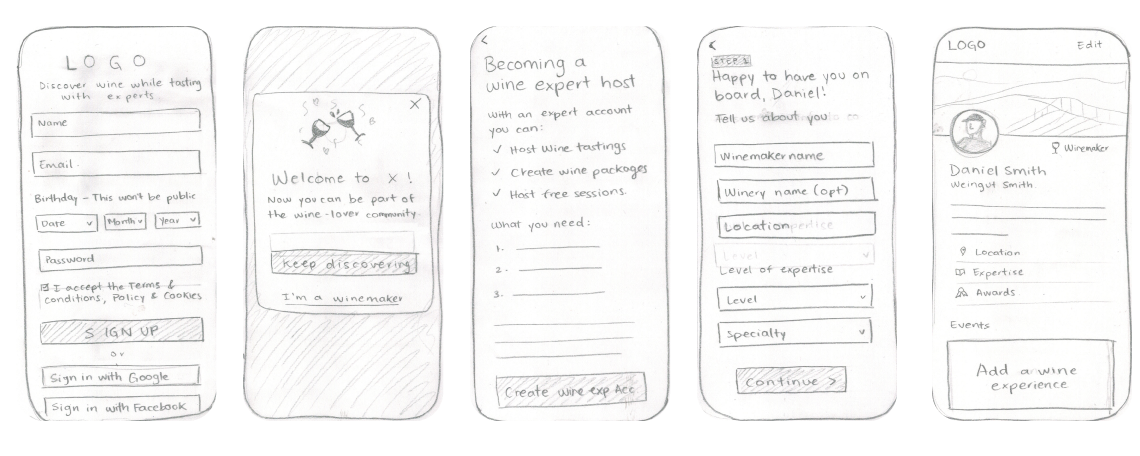
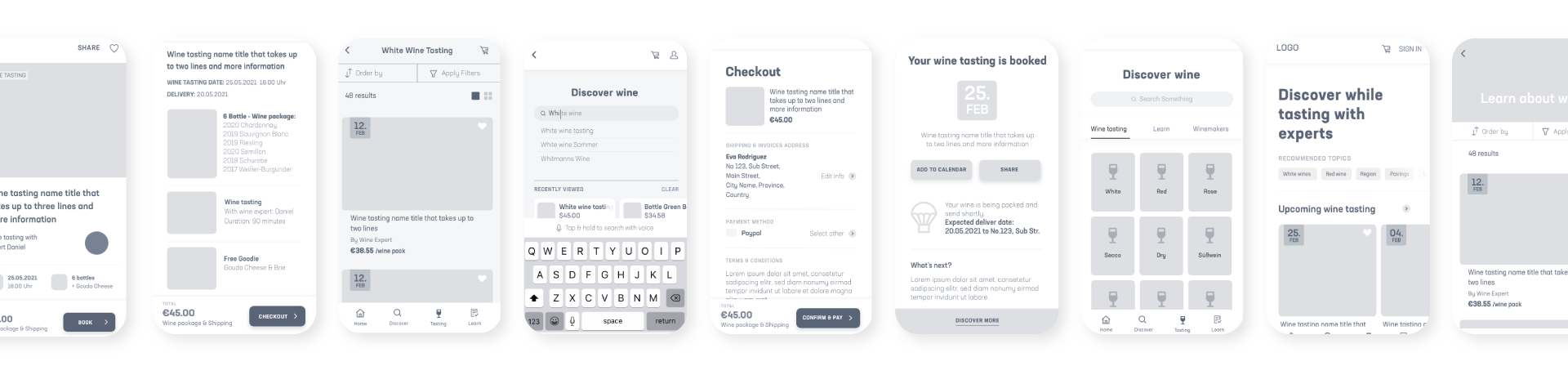
The paper sketches made the navigation, information architecture and flows clearer, now it was finally time to start designing digitally. Digital prototypes don't come without challenges, smaller details, fitting and general accessibility rules were taken into consideration. All designs were made with Adobe XD.
Before the formal usability test, I gathered some feedback on an informal level from peers, colleagues and friends, to determine if the flows actually made sense. Testing is the cornerstone of User Experience, feedback and validation are important not only to make a nice product, but one that makes sense for the target users.
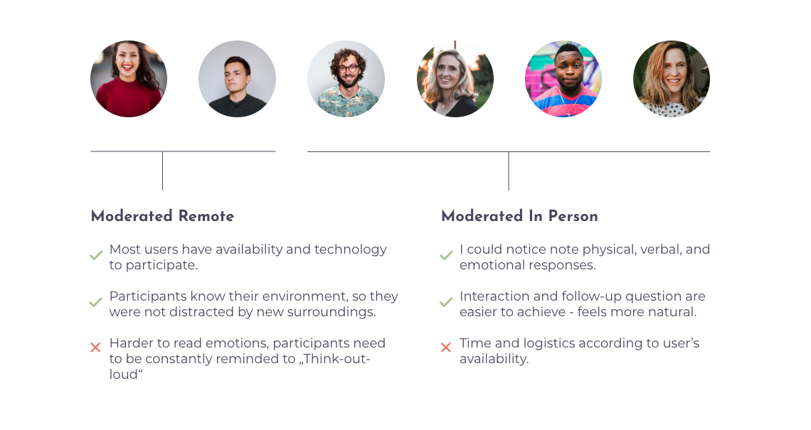
I aimed to assess the learnability of the app for first time users on mobile and desktop. My goal is to determine whether the users understand the main functions and how they navigate through the app, additionally we want to explore the satisfaction of the users.
The usability tests will be conducted with 6 participant and be held both in person and remotely. Moderated in person tests will be conducted with 4 participants, and moderated remote tests will be conducted with 2 participants. The usability test will be follow-up with a small satisfaction survey to complete the research.
PARTICIPANTS: All participants need to have a level of interest in the wine topic.
METRICS: Errors will be measured using Jakob Nielsen’s scale.
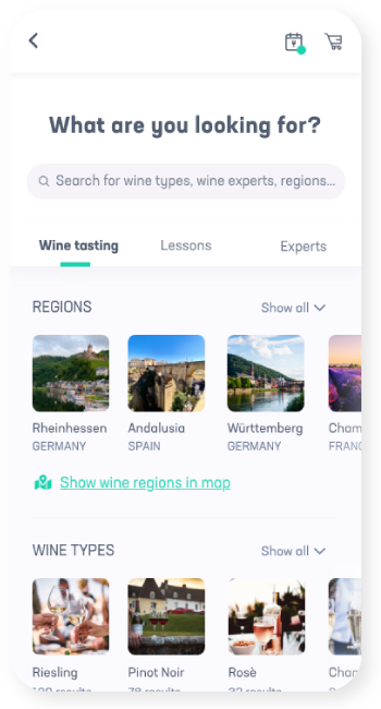
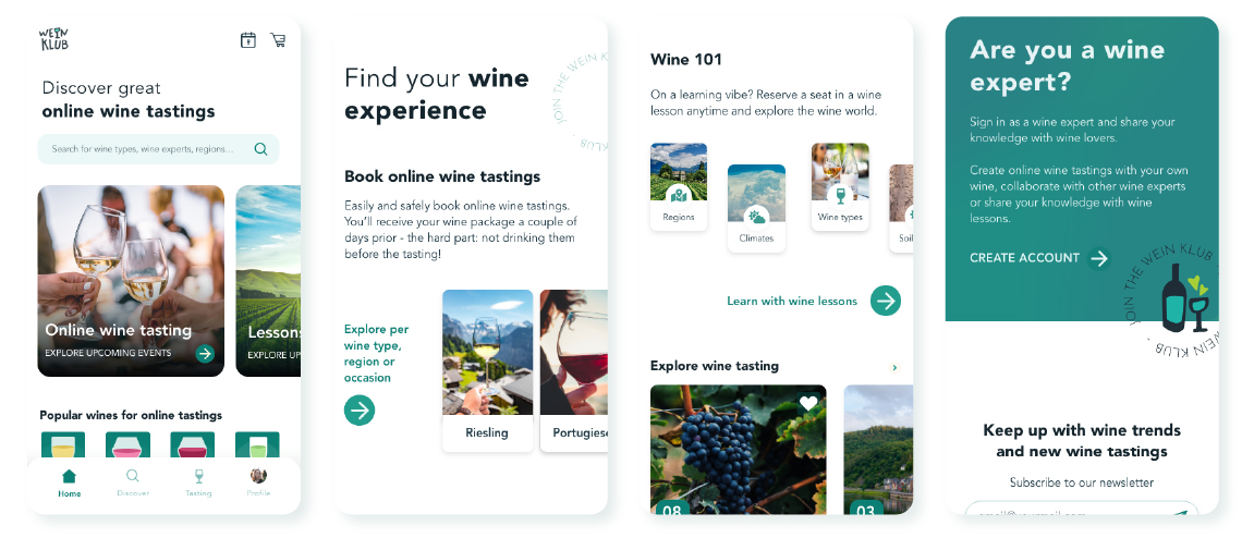
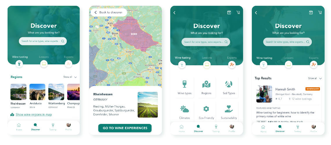
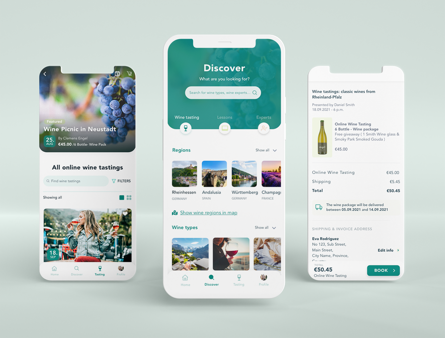
Usability Issue #1: “Discover should offer more categories and invite the user to explore”
This screen needs to be extended to meet user’s needs, the following changes were implemented: added categories per tab in a more visual way and added an "Experts" tab.
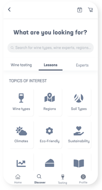
Usability Issue #2: “Learn tab was confusing and hard to understand”
The “Learn” direct access was removed since it was confusing to the user and a new path was determined to find them and the “tastings” remained in the main navigation as that is the main selling point from the app
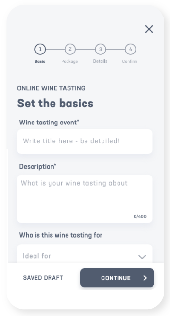
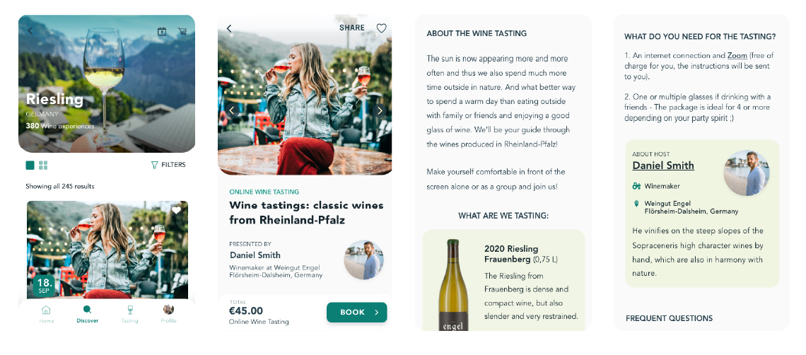
Usability Issue #3: “It’s confusing how the info I saw in the event doesn’t match the creation page.”
The elements seen in the (new) Online wine tasting page need to reflect one-to-one the elements the wine expert adds in the Event creation sequence.
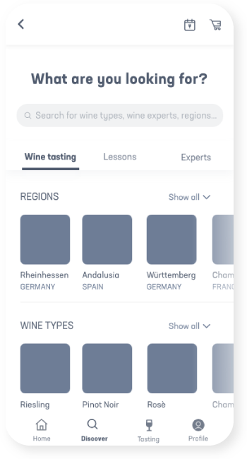
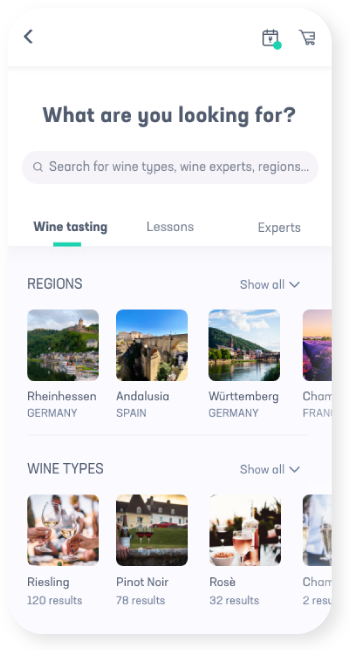
As a graphic designer, the lack of ideas is not the problem, rather committing to one. Preference tests and A7B testing allowed me to decide the direction of the project and the feeling the app would be aiming for. I decided to test the Discover screen, as most users in the usability test naturally gravitated there.
OPTION 1 was performing better, and the difference is 65.0% likely to be statistically significant. That meant, that I can be confident that it is actually better, and not performing better due to random chance.
Most participants preferred the regions as images, as they would easily recognize the regions by name, and it would get them to the next screen of information faster and easier.
However, I found that, like myself, some user still liked the idea of having a map to interact with and explore regions previously unknown. In an effort to provide the with this exploration sentiment, a call to action was added, where the user could access a map and discover from this perspective new regions.
OPTION 1
Regions with images
OPTION 2
Regions with maps
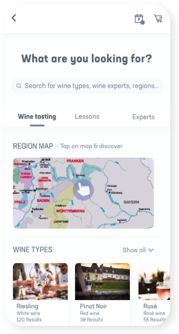
RESULT
A combination of both
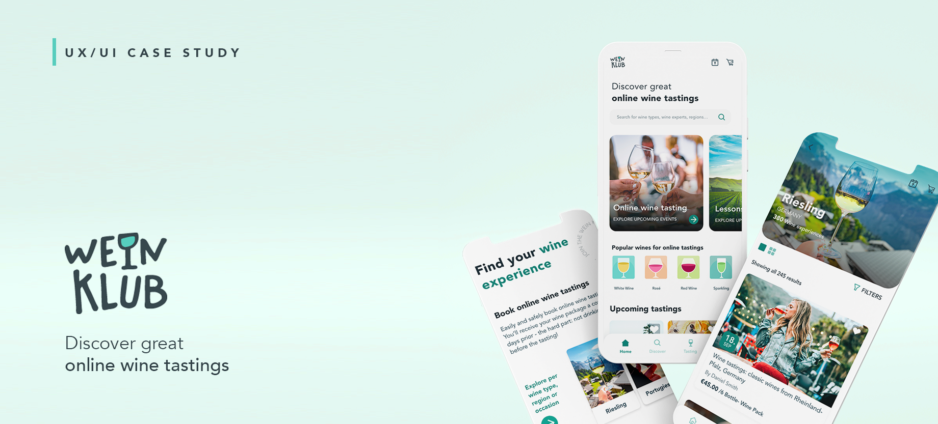
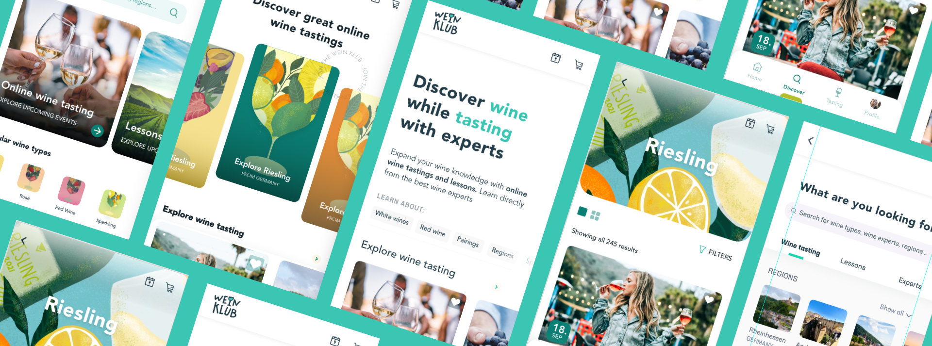
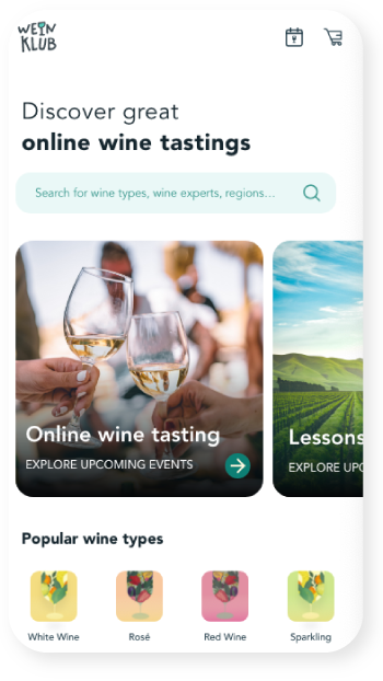
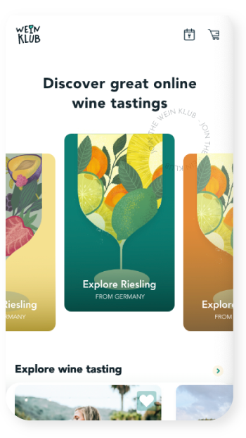
The visual presentation of WeinKlub is fun and clear, although some illustrations are used (and many more were planned) the design relays primarily in photos, as the user needs to be able to evaluate the tasting by the quality of the photos (and the information provided).
After 5 different sets of designs for the home and discover page, I decided it was time to involve other designers and potential users for a preference test, in order to determine which option was most popular and avoid my bias going forward.
"I’m able to digest the most information easily and quickly with this one."
"Real photos allusive to the topic and also the smaller tiles with the wine types"
"The colorful wine glasses really popped."
"Looks the most modern/ contemporary and fun"
"It adds so much more personality."
"Simple and to the point. Visual hierarchy and weight seems appropriate."
"I like the illustrations, but it looks like more juice than wine. I prefer this design coz it’s more clean."
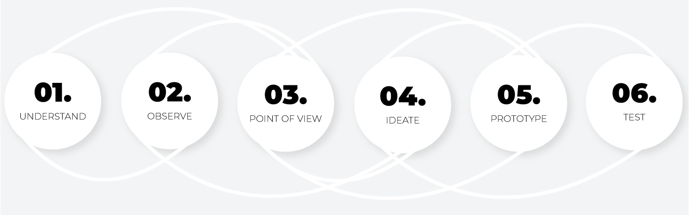
Through this ongoing project, I have learned the importance of good user research and how they can form concepts and transform preconceived ideas. As well as the power of iterations, and how incorporation Design Thinking and Agile UX guide to true and all-round designs, that fit the user needs and my standards as a designer.
- User research
- Usability Test
- A/B Testing
- Preference test
- Accessibility Guidelines
- WCAG Guidelines
- iOS Design Guidelines
- Inclusive color and typography
- Develop UI for wine expert profile creation and event creation process (online wine tasting or wine lessons)